
Infinite and responsive CSS grid
Published on
We often need to create grids that will display an unknown number of items responsively, for example in photo albums or in dashboards. There is actually a really simple way of how to do this:
.grid-container { //padding: 8px; // you can optionnally add padding as it often looks better display: grid; // Use display as grid grid-template-columns: repeat(auto-fit, minmax(16rem, 1fr)); // this is the magic that makes it all happen row-gap: 12px; // You can specify the vertical space between items column-gap: 96px; // You can specify the horizontal space between items justify-content: stretch; // how items should be place horizontally inside the grid cell if they do not occupy all the space align-content: stretch; // how items should be placed vertically inside the grid cell if they do not occupy all the space}As said in the comments, the line grid-template-columns: repeat(auto-fit, minmax(16rem, 1fr)); is the most important as it defines how the columns of the grid are created. Here we use repeat - which repeats the instructions on any number of items - with auto-fit, whose job is to try and resize the cells widths so they occupy the largest size possible while all being the same and most importantly while respecting the last instruction, minmax(16rem, 1fr). This last instruction ensures that each cell cannot have a width smaller than 16rem or larger than 1fr, 1fr being one fraction of the total available width (minus the gaps) of the grid-container.
If you want the same horizontal and vertical gaps you can also simply use the gap keyword which combines both row-gap and column-gap. Another option if you want to also set the height of the cells (and not only the width as show previously) is to also include the grid-template-rows property.
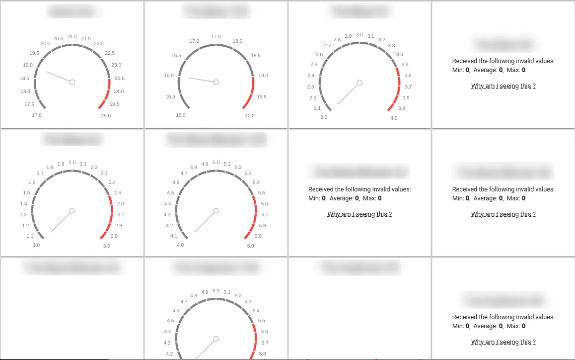
.grid-container { display: grid; grid-template-columns: repeat(auto-fill, minmax(300px, 1fr)); auto-columns: minmax(300px, 1fr); grid-template-rows: repeat(auto-fill, minmax(300px, 1fr)); auto-rows: minmax(300px, 1fr); gap: 3px; justify-content: stretch; align-content: stretch;}Finally, you can also handle the creation of extra rows and columns using auto-columns and auto-rows. This can for example be used to ensure that all extra cells respect the same dimensions as those having content as in the CasterStats grid.
For a more complete guide on CSS grids, check the wonderful guide at CSS-Tricks !
Note that you can also use flex layout to create grids of repeating items of the same size:
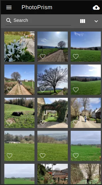
The grid of PhotoPrism is made using flex layout
.container { display: flex; // set display as flex flex-direction: row; // display items on a row flex-wrap: wrap; // Very important! Allow wrap of grid } .container>* { flex: 1 1 auto; // Set children to flex }As you can see it is pretty powerful too, but you will have to manage vertical space somehow.
Once again, CSS-Tricks has an incredible article about using flex layout !